The My eBay area is a UI/UX horror show which I’m not sure has been revisited since eBay launched last decade.
I believe that the purpose of the area is to allow users to review items they are buying/selling and message other users. The closest analog from a classic eCommerce site would be a basket or a shortlist.
eBay’s front end is generally not too bad. Finding and bidding/buying products works quite well. Launched in 2005 eBay has been around for a long time and is now a listed company (NASDAQ:EBAY).
Rather than rant about how bad the UI is…in this article I’m going to deconstruct and reconstruct My eBay to better fulfil user needs and improve the usability and UI aesthetics.
Why eBay and why now?
 As part of some studying I’m doing I needed to create some wireframes for a site that I use regularly but that could be improved.
Rather than just do wireframes I figured I’d make a case study of it as all to often any work that I do I can’t release because of NDA’s.
eBay stuck out like a sore thumb.
As a regular user I often find the interface confusing and it’s surprising that such a well established company have such a painful UI. They also have a ‘Tell us what you think’ link so I thought I’d go into detail…
I should make it clear that I have no affiliation with eBay they have never been a client of mine and this work is purely my personal views and not that of anyone I work for.
Redesign goals
My background is in product management so I’ll be looking at what can be improved not just on an aesthetic basis but also with revenue and most importantly simplicity as per the 6 simplicity factors (time, money, effort, cycles, deviance, routine) as defined by user behaviour expert BJ Fogg.
The current interface is very busy and combines quite a few different task types together. This likely does not help the user achieve the action that eBay is seeking which is to buy and sell items.
eBay’s business model for those who aren’t aware is to charge fees based on final selling price of the listed item. They also make an additional transaction fee if you use their subsidiary Paypal to pay for your item.
Approach
There are many people who offer up redesigns with no rational as to why they came to the result they did. I expect that this happens because it’s much more time consuming to do a proper job than knock out some pretty mockups.
I can only imagine that this leaves some people under the illusion that rebuilding the front-end of a site is potentially more trivial than it really is.
This is mainly going to be an evaluation of unmet user needs and one of many possible solutions to meet those needs.
Steps:
- Consider personas
- Identify current challenges and key user tasks
- Review and update information architecture (Sitemap)
- Review and update interaction design (Wireframes)
- Update visual design (Mockup)
I won’t be going too deeply into value proposition and prioritisation of what should be rebuilt but will look at the more common areas of UX as laid out in Jesse Garrett’s now well known book Elements of User Experience.
Testing
26/04: In this post very little regarding user research testing has been mentioned. It is a step that is all to often missed. I’ve added a little testing/feedback comment at the end of each section covering the kind of feedback/testing that should be involved.
This is critical to the process. If you are not doing it you are setting yourself up to fail. And fail hard.
I know of companies that have launched products spending tens of thousands on new products without even as much as a single bit of user feedback.
More often than not those projects have failed hard.
As part of this process you should be at a minimum doing the following:
- Personas: Researching who personas and validating that the organisations assumptions are correct
- Challenges & key tasks: You should be interviewing as many users as you can to further validate personas as well as identify and rank the user challenges
- Sitemap: There are many UX tools you can use such as card sorting and priortisation matrix’s
- Wireframes: You should get these in front of users and get them to try to complete key tasks to get feedback
- Mockups: Again more feedback to make sure you haven’t missed anything
- Live: Once live you should be testing your new designs against control
- Age: 35
- Gender: Male
- Education: Bachelors degree
- Job: Paramedic
- Income: £35,000
- Average
- Owns a smartphone
- Uses a tablet at home while watching TV
- Regularly uses technology at work
- a. Navigation: Quickly finding items he has bought or is buying/selling
- b. Communication: Communicating with other users is complicated
- James often has to try multiple options to find what he wants
- Wording appears inconsistent
- Menu items don’t seem to follow any particular order
- Review status of items he is considering buying/actively bidding on/selling
- Remove items he is monitoring for purchase or selling
- Place new bids on items he is buying
- Check details on items he is buying
- Update details on items he is selling
- Quickly find and sort through items he’s considering buying/selling
- Viewing seller’s other items, however only when they’re mentioned in the description
- Monitor products they are considering buying
- Monitor items they are selling
- Message other users relating to items they are buying/selling
- Items the sellers they are following have listed
- Searches they are following/Saved searches
- 1-3 items the user has explicitly expressed an active interest in
- 4-5 items the user may be interested in
- Remove non-core areas
- Reduce cycles: Simplifying the My eBay area will make its purpose clearer
- Reduce number of visible filters and consolidate
- Reduce deviance: Users are very familiar with list filtering tools in eCommerce experiences, showing every option available is not necessary
- Reduce cycles: Having too many options (20+) makes decision making harder for user
- Heavy users who list a large number of products need to be able to take a volume approach to reviewing and updating items
- James finds it difficult to find all messages relating to a particular item
- Replies aren’t shown when you look at messages so you have to hunt around
- Messages are not threaded
- Quickly find communications relating to items
- Wants to be able to see the entire conversation in one place
- See each individual message received
- Review sent messages in the sent message folder
- Sort messages by sender/received date/item status
- Messages grouped by item they relate to
- Reduce time: Navigating between messages relating to a single item takes longer than having all of the messages in a single place
- Reduce cycles: User has to remember previous messages
- Conversation view of messages
- Reduce deviance: A growing number of messaging systems use a conversation view, very few use unthreaded messages
- User interviews/surveys: Ask people what they like/dislike!
- Record/watch users: Nothing beats seeing your user using your product and seeing where they struggle
- In-site surveys/feedback: Whether it’s a tiny poll or feedback from customer service teams all valid information
- Analytics: See where conversion rates could be improved or where conversion funnels are leaking
- The menu hierarchy is grouped by task: Buying / Selling / Communication / Administration to make it easier for users to know where to start
- The majority of the secondary navigation in Buying/Selling/Communication can be replaced with filters.
- Messages have an additional filter called type, to filter between messages from sellers/buyers
- There is no activity feed here as these are already handled as notifications in the header
- Card sorting: Get users to organise how data should be organised for you
- Sitemaps: Use them to show how current information is and could be organised
- Mindmaps: Great way to get a birds eye view on what is going on and get everyone on the same page
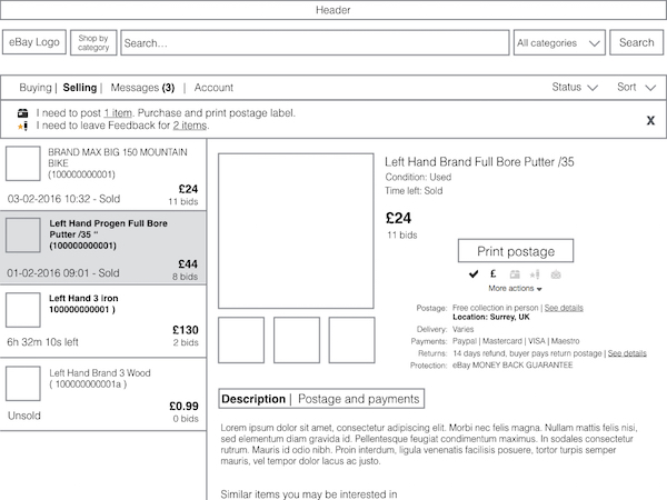
- Reduced options from 20+ to 4
- Split side bar titles between functional titles (Buying/Selling/Messages/Account) and filter items (Status/Sort)
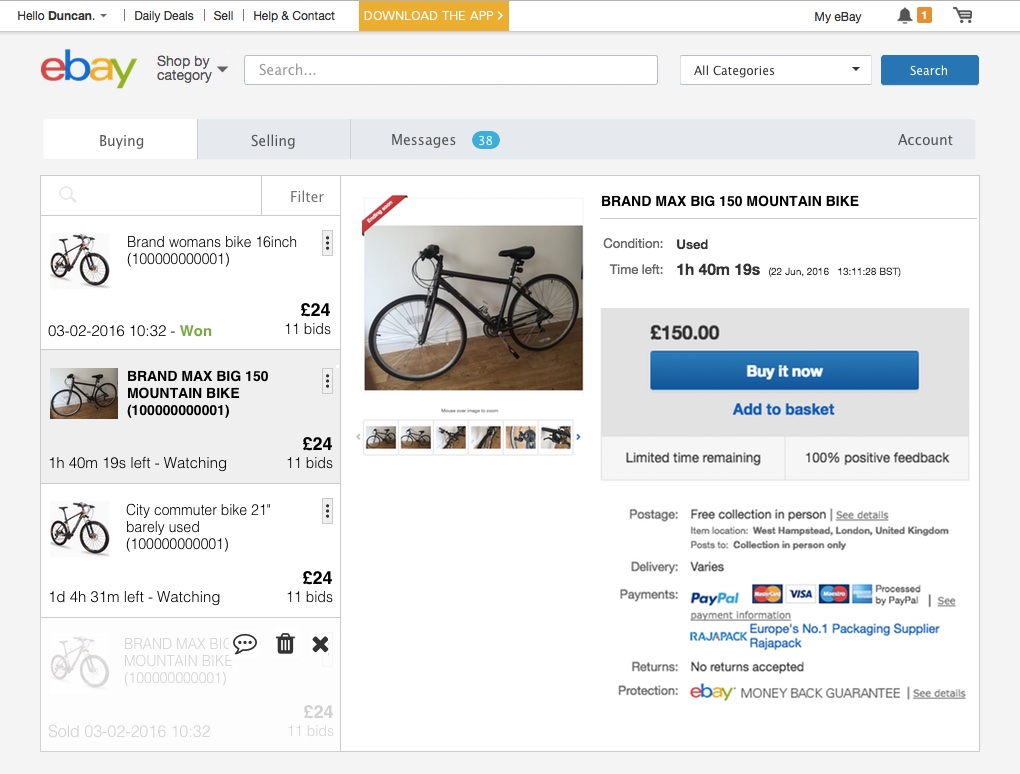
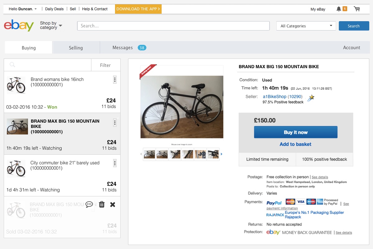
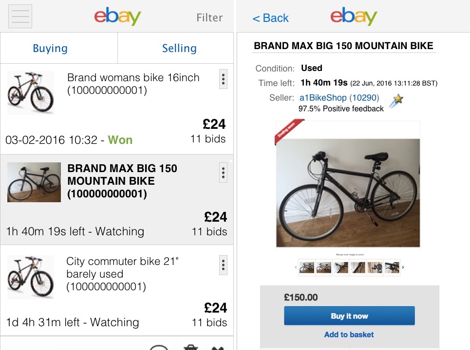
- Sidebar space used to show summarised list of items that user can select/scroll
- User can see listing info without leaving page
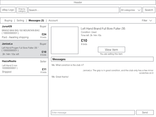
- Messages threaded to items so that there is only one thread per combined user & item
- Additional summary information in sidebar
- Filters to allow users to quickly get to relevant messages
- Colour scheme and visual elements maintained
- Added search filter to the items list
- Additional actions (message & remove) via toggle in top right of list items
In the fullness of time I will try to update the post to include testing and feedback on all of the above so that it is a full and realistic case study.
1. Personas
A handful of realistic personas are essential to be able to validate your design decisions. Ideally they should be based on actual user interviews combined with data. This will increase your odds of building what your users actually need.
While I’m sure that the product team at eBay have many personas I’m going to keep this part fairly simple and go with one persona.
I will however also be taking into account heavy eBay users who may have slightly different needs.
James Williams

“If I can I’ll buy things second hand rather than new and if I have something that I don’t work I’ll usually try and sell it. I don’t see the point of throwing away perfectly good stuff when there’s probably someone out there that could use it.”
James is a paramedic. He lives with his housemate in London. I work 5 days on 5 days off so when I’m not working I’ll often keep my eye on a few items and probably buy 1-2 items off eBay each month. Once every 2-3 months I also do a clear out to sell anything I don’t need.
Technology use:
Testing/Feedback
Where I have seen people fail the hardest regarding research is in their persona creation. Almost without exception both marketeers and management think that they know who their users are.
They build personas which inform products based purely on anecdotal and assumptions rather than research and data.
At a minimum personas should be built on a foundation of analytics data. This should be combined with user interviews ideally with well thought out questions/structure to build pictures of who the different user groups really are.
Hard data always wins in the boardroom so make sure you’ve got it to support your case.
Note: If you haven’t yet launched your product you might not know who your audience will be, that’s fine survey and interview your beta users before you launch (you have those right if not wtf?).
2. Identify current challenges and key user tasks
Once you have your persona, hopefully from your interviews you’ve uncovered some unmet needs or challenges your users are facing. These unmet needs/problems could also be based on feedback to your support or sales teams.
Part of the challenge the My eBay pages face is that they lacks definition. In my view it’s try to achieve too much in a single area.
As it is currently designed users can browse for new products via some of the lists (Searches you follow/Sellers you follow)…as well as act on items that they have shown an active interest in (buying/selling/communicating)
James faces problems relating to two main areas:
a. Navigation
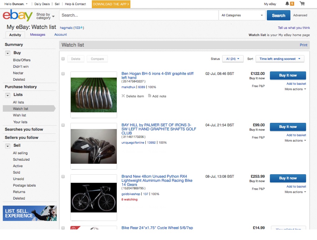
Navigation in My eBay is confusing with 20+ sidebar menu options and multiple tabs, filters and options.
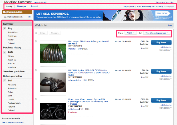
My eBay. Currently My eBay tries to achieve too much in a single view and has too many options.
James wants to be able to:
Sometimes James is interested in:
The current interface allows users to:
Grouped these relate to:
A better approach
Further considerations
b. Messaging
Current approach to messaging is similar to an unthreaded inbox and James often struggles.
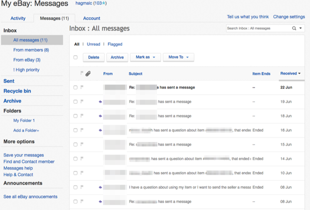
My personal eBay message inbox. All of these messages relate to two items I recently bought.
James wants to be able to:
The current interface allows users to:
A better approach:
Testing/Feedback
The question we’re really trying to answer here is what is broken?
Where I can I’ll do all of the following:
As a warning, the well known Henry Ford “Faster horse” quote comes to mind. Users often don’t have the best answer to solving problems so it’s really up to you to decipher and interpret all of the information correctly.
3. Review and update information architecture
Now we have identified some of the problems the user is facing it’s always worth mapping out the current sitemap. This will allow you to use it as a reference to make sure that you are not accidentally removing functionality as you move forwards with your design.
It also serves as a discussion tool as to what should be removed. I’ll keep this brief and will only be looking at architecture specifically relevant to My eBay.
Current My eBay sitemap
There are a lot of options. All told the user has no less than 47 different options to choose from. That is a lot especially given that the general rule is 5 options +/- 2.
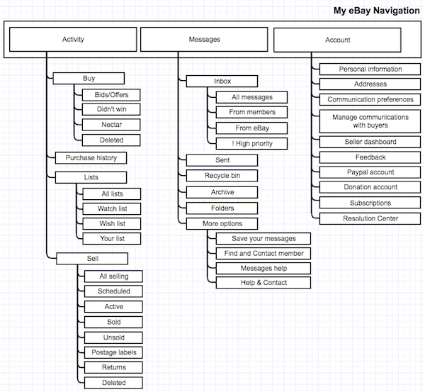
Current My eBay sitemap
Suggested My eBay sitemap
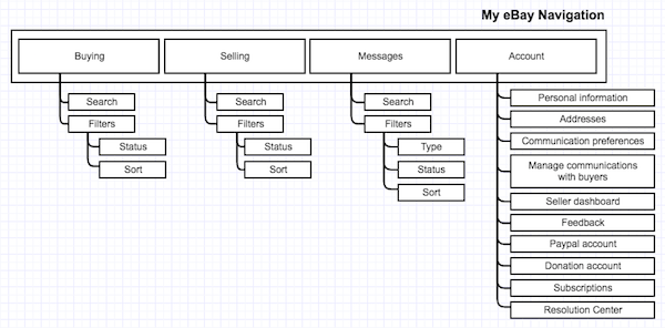
Suggested My eBay Sitemap
Testing/Feedback
You might have your own opinions on how data should be sorted but it might not be intuitive. Once you have some thoughts on how data could best be sorted you need to validate your thoughts.
Tools I like:
4. Review and update interaction design
Now we’ve plugged out a new sitemap there’s an important question of how the users will complete the steps you want them to in order for your app/site to accomplish its goals.
This should be mapped out in terms of the steps a user should take (workflows) as well as some rough designs (wireframes) so that you can test with colleagues and possibly users to see if the interactions make sense to users.
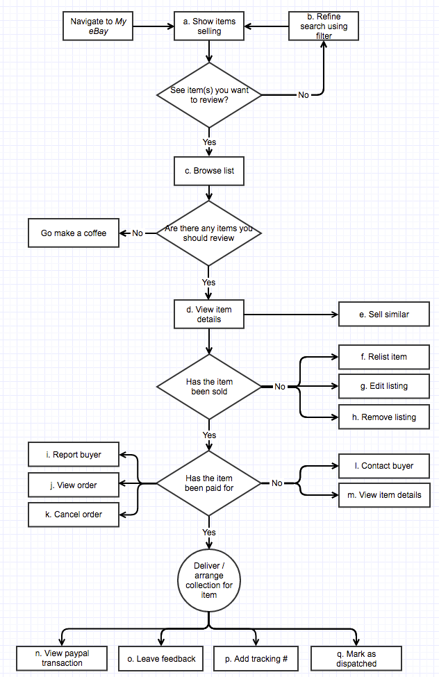
a. Workflows
The workflows below are simplified but essentially you should map out everything a user might want to do and the order that they should complete them.
Where possible the processes should be simplified to remove unnecessary steps. You could also go into more detail than I have around how users will interact. This could include whether steps load a new page, a menu, or reload items using js/ajax…
Those tasks should then be prioritised in order of importance and how prominent they should be on the site. This could detail actions/user process that are the most important to trigger the user into doing.
As before you should have some data to help guide the importance and usage of the features/processes so that you can establish the correct visual hierarchy. There’s a great article at smashing magazine with more detail on workflows here.
Buyer workflow
The buyer workflow in eBay is pretty straight forwards. Once you’ve shortlisted or bid on items you then return to review the items and their progress later on.
Seller workflow
Slightly more complicated, the sellers workflow has to cater for more options and also has to cater for quite a wide degree of flexibility.
Messages workflow
I’m not going to map out messages as I’ve got a fairly set idea of how it could work. There’s also only a few actions, view message, send message, delete message.
b. Mockups
This is where the rubber hits the road and you can start to roughly sketch out the layout.
Good practice would dictate that you have a list of all of the processes in your workflows above and that your make sure that the user can figure out how to perform each of them.
Navigation
The current site has over 20 options to choose from. I’ve cut this right down and tried to make something that is browser and tablet friendly.
Main changes:
Messages
The current messages lack a lot of context. On the assumption that 90% of messages are sent in relation to an item that’s how they should be grouped. Those that are not related to an item can just be listed as a standalone conversation.
Main changes:
Testing/Feedback
Once I have some wireframes I would usually get them in front of a few potential users. It doesn’t matter if that’s a few unsuspecting people in the local coffee shop or users online.
Usually I’ll build wireframes using GoMockingBird or a presentation tool like Keynote/Powerpoint and then get feedback using a tool like InvisionApp.
It’s critical when getting feedback not to just let users click through your interface. Ask them to achieve specific tasks and measure how they completed those tasks time/clicks/effort. Did they get lost? If so where…
5. Update visual design
Last step! Now we have some wireframes and assuming we’ve done some testing, even if it’s only internal, it’s time to do some colouring in.
Now I’m not a designer by any stretch of the imagination so apologies for the quality. I built the mockup with Pixelmator rather than Photoshop to see how it would work out. The elements are spaced on a standard 12 column 960px template.
Rather than mockup the whole of the My eBay area I’ve decided to go for just one screen. Mainly because I’m short on time more than anything else.
Before/After compared
Hint: Move your mouse of the image to see the before and after mockups.
Final mockup
Testing/Feedback
Once I’ve got my final mockups again I’ll usually get them into InvisionApp and get some more feedback. You’d be surprised at how helpful users can be at spotting UX/UI bugs, typos and things that don’t work.
In the past I’ve used actual users, Mechanical turk and Upwork to find people to test and give feedback on interfaces.
Finally get it live and A/B test it alongside current designs. See if your new design performs better.
Conclusion
When eBay was launched the areas addressed above would probably have met needs. However as UI/UX has evolved expectations are higher and the current site is not meeting needs of users as best as it could.
What I’ve suggested is just one option. Before an overhaul like this I would expect quite a few more options as well as significant testing and user feedback to make sure it’s the right direction.
It has been quite fun putting together this post and hopefully someone finds it useful. At a minimum I hope that eBay update their site sometime in the next 10 years.
Let me know what you think in the comments.





 Follow me on Twitter
Nice read, very interesting to see how you break down the process in different stages. I’m with you on hoping eBay will do something on their design! 😉
Thanks much appriciated 🙂
eBay has been launched muuuuuuuuuuch earlier than 2005, actually in 1995 or so… but anyway, good read.
Great case study of decent UX process, shame Ebay is too large an organisation to get this stuff right, sometimes one designer is the key to success.